Improvement to HUD – How to Better Manage Your Tasks
We did a post the other day on improvements we made to the IronMQ HUD to make it easier to manage your message queues. We also made some changes to the HUD to make it easier to manage your tasks and scheduled jobs. Here’s the major changes for the IronWorker HUD.
IronWorker – Task List
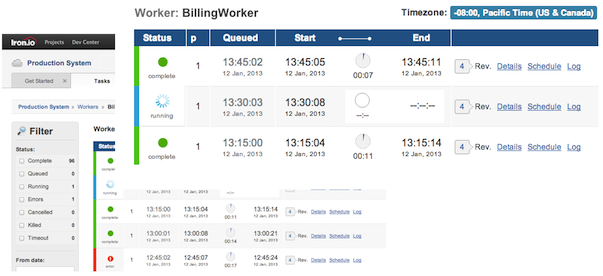
The task list got a facelift both in look and organization. We changed the icons to give you a clearer view of the status of tasks. We also organized the columns better and added a duration icon. Simple, clean, and, as Chad likes to say, beautiful.
 |
| View of Worker Tasks |
IronWorker – Scheduled Tasks
For scheduled tasks, we organized things a bit better to draw out the scheduled tasks that ran and when they’re supposed to run again. The goal is to provide you with a clear view at a glance of all the things that are happening on a schedule in your app.
 |
| View of Scheduled Tasks |
Let Us Know Your Thoughts
If you have any special requests – something that will make our services better or easier to use – please let us know. Send us a note via our support channel or check in at our public chat room. The team loves the input.
